-
INTERACTIVE
EBOOKS
-
PRINTED
BOOKS

-
DIGITAL
PRINT DESIGN


Author and Artist behind the work
Author, Cover Design, Title Designs, Illustrations, Font Design, Iconography Design, and Layout. The outcome of the project yielded a 1st place ranking on Amazon sales throughout Canada, and remained #1 in its categroy for over two months.
AUTHOR WEBSITE PUBLICATION


BOOKLET DESIGN
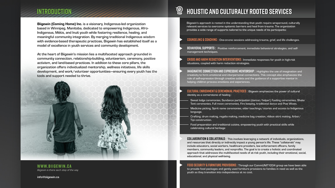
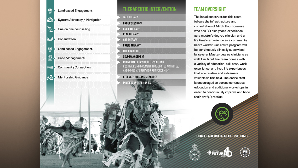
The Biigewin (Coming Home) Therapeutic Services booklet was developed to inform individuals seeking support about the various foundational initiatives implemented by this Manitoba-based organization. The booklet was carefully crafted to highlight the programs in a visually appealing and engaging way, intended to attract readers' attention. Design elements include custom vector graphics aligned with the focus areas, treatment of imagery to maintain the publication's color scheme, and integration of the organization’s branding system and hand-forged iconography into both print and digital download formats.
VIEW BIIGEWIN WEBSITE


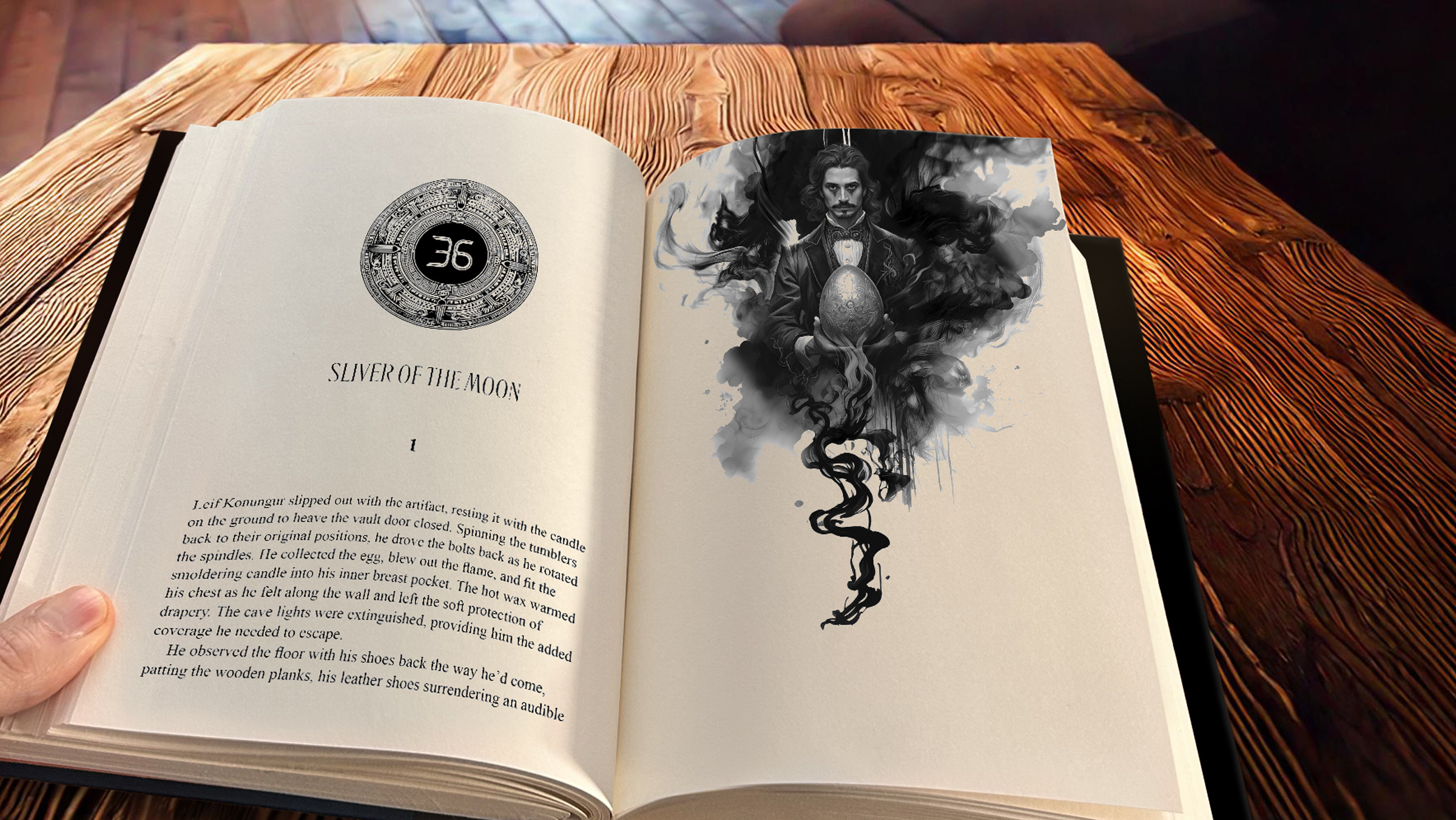
Cover designs for Hardcover, Paperback, E-Book, and upcomming audiobook
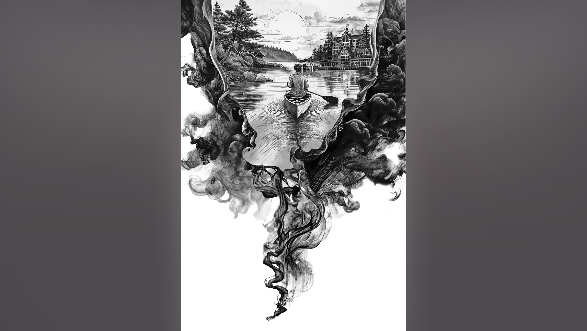
Custom illustrations to feature and showcase the story that has become a best-selling paperback on Amazon. Hand-forged title designs and eye-catching illustrations to draw readers into this Canadian tale.
VIEW BOOK VIEW PUBLICATION

BROCHURE DESIGN
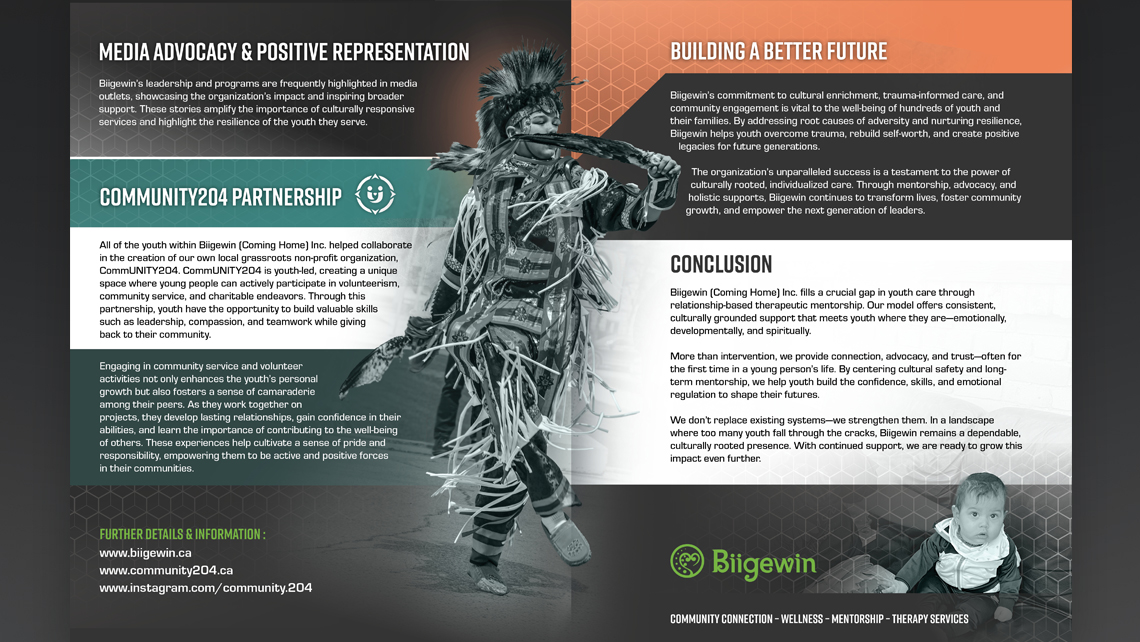
Biigewin ( Coming Home ) Therapeutic Services brochure design was introduced with a theme to help bridge communications for both print and web solutions. The traditional tri-fold design encompassed custom hand-drawn / vectorized iconography and graphic design elements to help shape the delivery of the organization's message.
VIEW BIIGEWIN WEBSITE


Community204 serves as an umbrella organization in supporting Winnipeg's Indigenous community and those from all walks of life. The outcome yielded a tri-fold brochure to be used in promoting the various programs available within this empowering organization. Beyond the scope of the print and digital brochure, a website was also forged to help deliver greater information and provide a learning tool for the teachings and knowledge that Community204 was founded from. ( See link below for the website )
VIEW COMMUNITY204 WEBSITE


COURSE CALENDAR
Providing the creative direction for ATC's Course Calendar and Brochures; the outcome served to update a design I produced previously. Having also produced ATC’s Branding system in addition to bus bench advertisements, and web and intranet design for the Louis Riel School Division, which included ATC. The course brochures ( Cards ) as shown below served as part of this re-design outcome. The outcome of this project sought to encapsulate a modern approach to the school’s evolving marketing materials and image.


COURSE CARDS
Serving as a supplement toward course-specific information; the outcome of the card design was to provide an alternative method in delivering brochure materials on a glossy card stock medium. The result helped to propel prospective students to the school's website and social media presence for more information and options on student's routes toward enrolment

The Children's publication utilized traditional illustrations which were water-coloured using traditional methods. The stylistic outcome was meant to engage readers between the ages of 5-10 and this book is found in schools throughout St.Vital and St.Boniface. The video was created as a medium for deploying a narrated asset to compliment the book’s release for teachers and superintendents.

ADVERTISING INFORMATION BOOK
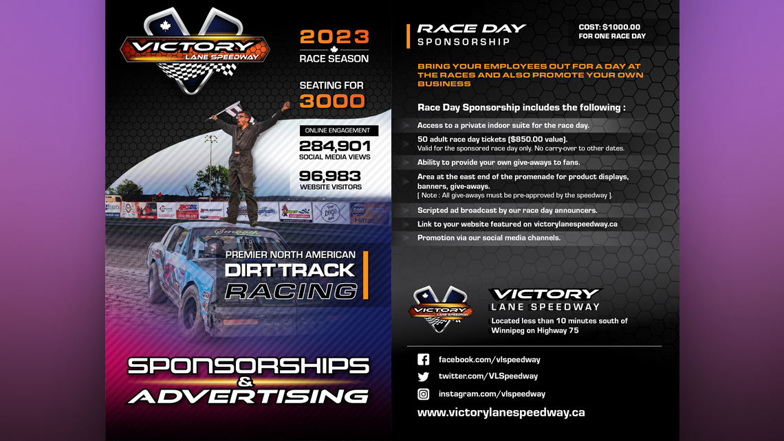
The project’s scope was to broaden the attention of potential advertisers with the newly acquired Victory Lane Speedway. Revitalizing aging material, the goal was to incorporate eye-catching racing colours found on vehicle graphics. The project’s outcome helped forge a pathway for the new owners toward branding and communications.

CATALOGUE COVER
The cover was forged using a hand-drawn illustration, watercoloured to produce an eyecatching image of a father and son working together using tools found in Princess Auto. The idea was forged from the relationship of making memories together with the tools found in the catalogue. The source image was captured by a photographer and the rights were released for the illustration toward the final project. The proof shown was not the final print copy and remains as an example to my portfolio.